Pythonでデータ分析入門2(初めてのロジスティック回帰(2クラス分類))
Pythonでロジスティック回帰を使って2クラス分類問題を解いてみます。
本投稿のコードは、Jupyter Notebook上で実行しています。コンソールで実行する場合は、適宜plotなどの表示用命令を追加してください。
目次
- ロジスティック回帰分析とは
- 分析するデータ
- ライブラリのインポートとデータの読み込み
- Versicolor種かどうかの列を作る
- データの統計量の確認と欠損値の確認
- データの分布を確認する
- データを学習用と検証用に分割する
- 学習と予測を行う
- モデルの性能を確認する
- モデルを改善する
ロジスティック回帰分析とは
ロジスティック回帰分析は、説明変数から2値の目的変数(0か1、陰か陽、プラスかマイナスなど)のどちらが起こる確率が高いかを予測する手法です。
xを入力(説明変数)、αとβをパラメータとしたとき、確率pは下記の式となります。
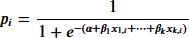
このパラメータαとβを学習によって求めて、任意の説明変数から目的変数の確率を予測するわけです。
分析するデータ
seabornに備わっているirisというデータセットで試してみます。
界隈で有名な、アヤメの種類を寸法から分類するデータセットです。
列 |
内容 |
|---|---|
sepal_length |
萼片の長さ |
sepal_width |
萼片の幅 |
petal_length |
花弁の長さ |
petal_width |
花弁の幅 |
species |
花の品種(Setosa, Versicolor, Virginica) |
データセットには花の品種が3種類あります。
今回は2値分類を試してみますので、Versicolor種であるかどうかを分類してみます。
ライブラリのインポートとデータの読み込み
pandasとseabornをインポートして、irisデータセットを読み込みます。
>>> import pandas as pd
>>> import seaborn as sns
>>> df = sns.load_dataset('iris')
Versicolor種かどうかの列を作る
irisデータセットには3品種が登録されていますが、今回はVersicolor種かどうかだけを判定しますので、Versicolor種かどうかを示す列をデータフレームに追加します。
>>> df['is_versicolor'] = df['species'].apply(lambda x: 1 if x == 'versicolor' else 0)
is_versicolor列が1の場合はVersicolor種、0の場合はそれ以外の品種ということになります。
データの統計量の確認と欠損値の確認
まず、欠損値がないかどうかを確認します。
>>> df.isnull().sum()
sepal_length     0
sepal_width      0
petal_length     0
petal_width      0
species          0
is_versicolor    0
dtype: int64
欠損値はありませんでした。もし欠損値が存在する場合には、欠損値を含むデータを除外したり、欠損値を何かで埋めるような措置が必要になります。
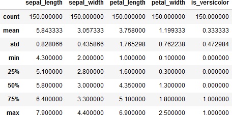
では、データの統計量を確認してみます。
>>> df.info()
>>> df.describe()
<class 'pandas.core.frame.DataFrame'>
RangeIndex: 150 entries, 0 to 149
Data columns (total 6 columns):
 #   Column         Non-Null Count  Dtype
---  ------         --------------  -----
 0   sepal_length   150 non-null    float64
 1   sepal_width    150 non-null    float64
 2   petal_length   150 non-null    float64
 3   petal_width    150 non-null    float64
 4   species        150 non-null    object
 5   is_versicolor  150 non-null    int64
dtypes: float64(4), int64(1), object(1)
memory usage: 7.2+ KB
データの分布を確認する
各列のデータの分布を確認します。
具体的には、各列毎にヒストグラムを描画してみます。その際、Versicolor種であるかどうかを分けたヒストグラムにします。
こうすることで、品種毎にデータの分布が異なっていないか確認します。品種でデータの分布が異なっていれば、それを手がかりに予測できそうですからね。
>>> from matplotlib import pyplot as plt
>>> df_sepal_length_0 = df[df['is_versicolor']==0]['sepal_length']
>>> df_sepal_length_1 = df[df['is_versicolor']==1]['sepal_length']
>>> sns.histplot(df_sepal_length_0, kde=True, color='lightgreen', binrange=(4,8.5), binwidth=0.25)
>>> sns.histplot(df_sepal_length_1, kde=True, color='orange', binrange=(4,8.5), binwidth=0.25)
>>> plt.legend(labels=["not_versicolor", "versicolor"], loc='upper right')
>>> plt.show()
>>>
>>> df_sepal_width_0 = df[df['is_versicolor']==0]['sepal_width']
>>> df_sepal_width_1 = df[df['is_versicolor']==1]['sepal_width']
>>> sns.histplot(df_sepal_width_0, kde=True, color='lightgreen', binrange=(1.5,5), binwidth=0.25)
>>> sns.histplot(df_sepal_width_1, kde=True, color='orange', binrange=(1.5,5), binwidth=0.25)
>>> plt.legend(labels=["not_versicolor", "versicolor"], loc='upper right')
>>> plt.show()
>>>
>>> df_petal_length_0 = df[df['is_versicolor']==0]['petal_length']
>>> df_petal_length_1 = df[df['is_versicolor']==1]['petal_length']
>>> sns.histplot(df_petal_length_0, kde=True, color='lightgreen', binrange=(1,7), binwidth=0.25)
>>> sns.histplot(df_petal_length_1, kde=True, color='orange', binrange=(1,7), binwidth=0.25)
>>> plt.legend(labels=["not_versicolor", "versicolor"], loc='upper right')
>>> plt.show()
>>>
>>> df_petal_width_0 = df[df['is_versicolor']==0]['petal_width']
>>> df_petal_width_1 = df[df['is_versicolor']==1]['petal_width']
>>> sns.histplot(df_petal_width_0, kde=True, color='lightgreen', binrange=(0,3), binwidth=0.25)
>>> sns.histplot(df_petal_width_1, kde=True, color='orange', binrange=(0,3), binwidth=0.25)
>>> plt.legend(labels=["not_versicolor", "versicolor"], loc='upper right')
>>> plt.show()
4つまとめて出力しました。
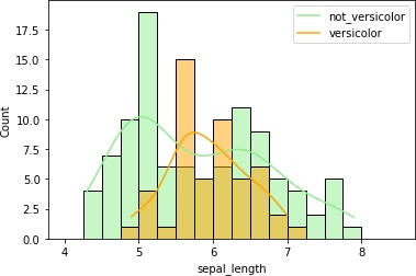
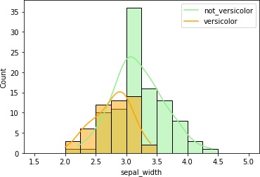
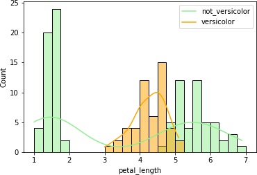
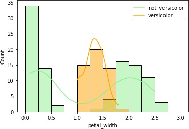
petal_lengthとpetal_widthはVersicolor種のヒストグラムの重なりが少なくて、これらのデータを使えば推定できそうです。
データを学習用と検証用に分割する
今あるデータでモデルの学習と、学習したモデルがどの程度の性能なのかの検証をしなければなりません。
そこで、データを学習用と検証用に分割します。
説明変数にはpetal_lengthとpetal_widthだけを使ってみます。目的変数はis_versicolorです。
>>> from sklearn.model_selection import train_test_split
>>> X = df[['petal_length','petal_width']]
>>> Y = df['is_versicolor']
>>> train_X, test_X, train_y, test_y = train_test_split(X, Y, test_size=0.3, random_state=0, stratify=Y)
trainが学習用、testが検証用データになります。
学習と予測を行う
ロジスティック回帰モデルで学習を行います。
まずは学習です。
>>> from sklearn.linear_model import LogisticRegression
>>> model = LogisticRegression()
>>> model.fit(train_X, train_y)
学習が完了しました。それでは予測してみます。予測結果の最初の5個を表示します。
>>> result = model.predict_proba(test_X)
>>> print(result[:5])
[[0.7782987  0.2217013 ]
[0.54706228 0.45293772]
[0.64456034 0.35543966]
[0.78085148 0.21914852]
[0.77000384 0.22999616]]
左側の列が0と判定される確率、右側の列が1と判定される確率になります。
では、1の確率が0.5を超える項目がいくつあるのか表示してみましょう。
>>> result_1 = model.predict_proba(test_X)[:, 1]
>>> print(sum(result_1 > 0.5))
6
6個しかありませんでした。
ちょっと少ないですね。
モデルの性能を確認する
混同行列
混同行列を表示してみます。
混同行列というのは、2値分類問題の出力を2x2のマトリクスにまとめたもので、モデルの性能評価指標の1つになります。
予測値 |
|||
Positive |
Negative |
||
実際 |
Positive |
True Positive |
False Negative |
Negative |
False Positve |
True Negative |
|
>>> from sklearn.metrics import confusion_matrix
>>> import numpy as np
>>> pred = model.predict(test_X)
>>> cm = confusion_matrix(y_true=test_y, y_pred=pred)
>>> df_cm = pd.DataFrame(np.rot90(cm, 2), index=["Positive (Actual)", "Negative (Actual)"], columns=["Positive (Predict)", "Negative (Predict)"])
>>> print(df_cm)
>>> sns.heatmap(df_cm, annot=True, fmt="2g", cmap='Blues')
>>> plt.yticks(va='center')
>>> plt.show()
Positive (Predict)  Negative (Predict)
Positive (Actual)                   1                  14
Negative (Actual)                   5                  25
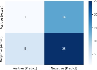
正しく判定できたのは26/45 = 0.58しかありませんでした。
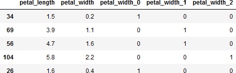
実際にVersicolor種であると判定したものと真値を比較してみましょう。
>>> verify = pd.DataFrame(test_y)
>>> verify['pred'] = pred
>>> verify[verify['pred']==1]
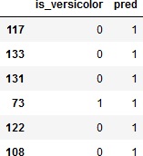
これでは「Versicolor種はない」と言うのとたいして変わりませんね。
ROC曲線とAUC
ROC(Receiver Operating Characteristic)曲線の描画と、AUC(Area Under Curve)の計算をしてみます。
ROC曲線は、横軸にFPR(False Positive Rate)、縦軸にTPR(True Positive Rate)をとったグラフです。PositiveとNegativeの判定の閾値を変えていくとPositiveと判定される数が変わっていきます。そうするとFPRとTPRの値も変わっていきます。閾値を変えながらFPRとTPRの値がどうなるかプロットしたのがROC曲線です。
AUCはROC曲線の下側部分の面積です。この面積が大きいほど良いモデルになります。
ではROC曲線の描画とAUCスコアの計算をしてみます。
>>> from sklearn.metrics import roc_auc_score, roc_curve
>>> result_1 = model.predict_proba(test_X)[:, 1]
>>> auc_score = roc_auc_score(y_true=test_y, y_score=result_1)
>>> print(auc_score)
>>> fpr, tpr, thresholds = roc_curve(y_true=test_y, y_score=result_1)
>>> plt.plot(fpr, tpr, label='roc curve (area = %0.3f)' % auc_score)
>>> plt.plot([0, 1], [0, 1], linestyle=':', label='random')
>>> plt.plot([0, 0, 1], [0, 1, 1], linestyle=':', label='ideal')
>>> plt.legend()
>>> plt.xlabel('false positive rate')
>>> plt.ylabel('true positive rate')
>>> plt.show()
0.68
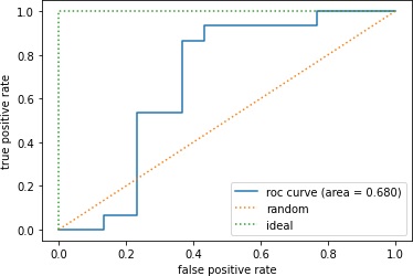
まあ、あまり性能良くないことがわかりました。
モデルを改善する
前述のpetal_widthのヒストグラムでは、Versicolor種とそれ以外がわりときれいに分かれています。
そこで、petal_widthをビニング(binning、離散化)してみます。
ビニングというのは、連続的な説明変数を何らかのルールに従って分割することでカテゴリ変数に変換することです。つまり、複数の値の範囲を設定して、各データを設定した範囲毎にカテゴライズします。
>>> bins_petal_width = [0, 0.75, 1.75, 3]
>>> X_cut, bin_indice = pd.cut(X["petal_width"], bins=bins_petal_width, retbins=True, labels=False)
>>> X_dummies = pd.get_dummies(X_cut, prefix=X_cut.name)
>>> X_binned = pd.concat([X, X_dummies], axis=1)
上記の例では、petal_widthを0~0.75、0.75~1.75、1.75~3の4つのカテゴリに分割します。そして、作成したカテゴリ変数をダミー変数化して、もとのデータフレームに結合します。
X_cutにどの範囲に分割されたかを示すラベルが、bin_indiceに分割の閾値が入ります。見てみましょう。
>>> X_cut.value_counts(sort=False)
0    50
1    54
2    46
Name: petal_width, dtype: int64
>>> print(bin_indice)
[0.   0.75 1.75 3.  ]
ビニングしたら、データを学習用と検証用に分割します。
>>> train_X, test_X, train_y, test_y = train_test_split(X_binned, Y, test_size=0.3, random_state=0, stratify=Y)
>>> train_X.head()
では、再度モデルの学習をして、ROC曲線とAUCを求めてみます。
>>> model = LogisticRegression()
>>> model.fit(train_X, train_y)
>>>
>>> result_1 = model.predict_proba(test_X)[:, 1]
>>> auc_score = roc_auc_score(y_true=test_y, y_score=result_1)
>>> print(auc_score)
>>> fpr, tpr, thresholds = roc_curve(y_true=test_y, y_score=result_1)
>>> plt.plot(fpr, tpr, label='roc curve (area = %0.3f)' % auc_score)
>>> plt.plot([0, 1], [0, 1], linestyle=':', label='random')
>>> plt.plot([0, 0, 1], [0, 1, 1], linestyle=':', label='ideal')
>>> plt.legend()
>>> plt.xlabel('false positive rate')
>>> plt.ylabel('true positive rate')
>>> plt.show()
0.9755555555555556
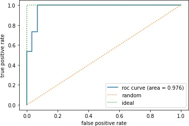
なんだかいきなり良い結果になりました。
混同行列でどの程度正解したかを確認してみます。
>>> pred = model.predict(test_X)
>>> cm = confusion_matrix(y_true=test_y, y_pred=pred)
>>> df_cm = pd.DataFrame(np.rot90(cm, 2), index=["Positive (Actual)", "Negative (Actual)"], columns=["Positive (Predict)", "Negative (Predict)"])
>>> print(df_cm)
>>> sns.heatmap(df_cm, annot=True, fmt="2g", cmap='Blues')
>>> plt.yticks(va='center')
>>> plt.show()
Positive (Predict)  Negative (Predict)
Positive (Actual)                  15                   0
Negative (Actual)                   2                  28
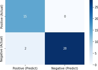
43/45=0.96と、かなり正解できました。
更新日
公開日
広告
Pythonでデータ分析カテゴリの投稿
- DataFrameの欠損値を特定の値で置き換える
- Pythonでpandas入門1(データの入力とデータへのアクセス)
- Pythonでpandas入門2(データの追加と削除および並び替え)
- Pythonでpandas入門3(データの統計量の計算)
- Pythonでpandas入門4(データの連結と結合)
- Pythonでpandas入門5(欠損値(NaN)の扱い)
- Pythonでデータを学習用と検証用に分割する
- Pythonでデータ分析入門1(初めての回帰分析)
- Pythonでデータ分析入門2(初めてのロジスティック回帰(2クラス分類))
- Pythonでデータ分析入門3(初めての決定木(多クラス分類))
- Pythonで回帰モデルの評価関数
- Pythonで箱ひげ図を描く
- Python(pandas)でExcelファイルを読み込んでDataFrameにする
- pandasでカテゴリ変数を数値データに変換する
- pandasでクロス集計する
- pandasで同じデータ(要素)がいくつあるか調べる
- pandasで相関係数を計算する
- pandasとseabornでデータの可視化(散布図行列)
- pandasの学習用のデータセットを入手する
- scikit-learnのサンプルデータセットを入手する